Mastering The Art Of Drawing A Cape: Flow, Form, And Flair
Have you ever wondered what makes a character truly stand out? Quite often, it's the way their clothing moves, especially something as grand as a cape. Drawing a cape that feels alive, that billows with purpose, or drapes with grace, is a skill many artists want to get better at. It’s a bit like giving your characters a voice through their attire, you know?
Whether you're sketching a powerful superhero, a mysterious wizard, or a regal monarch, the cape is, well, it's a very important part of their look. It adds drama, movement, and a sense of story to your artwork. Getting the hang of how fabric behaves, how it catches the wind, or just hangs there, can really make your drawings pop.
So, if you're ready to add that extra bit of magic to your characters, perhaps by giving them a truly stunning piece of flowing cloth, then you've come to the right place. We're going to explore all the little things that go into drawing a cape that looks just right, and honestly, it’s a lot of fun to figure out.
Table of Contents
- Understanding Cape Basics: More Than Just a Cloth
- Drawing Capes in Motion: Capturing Dynamic Flow
- Making Your Cape Look Real: Light, Shadow, and Texture
- Different Cape Styles and Designs
- Common Mistakes and How to Fix Them
- Digital Tools for Drawing Capes
- Frequently Asked Questions About Drawing Capes
Understanding Cape Basics: More Than Just a Cloth
Before you even pick up your drawing tool, it helps a lot to think about what a cape actually is and how it acts. It's not just a flat piece of material, it's something that responds to gravity, to movement, and to the air around it. So, you know, getting a handle on these basics can really change your approach.
Fabric Types and Their Behavior
The kind of fabric a cape is made from totally changes how it looks and moves. Think about it: a heavy, thick wool cape will hang very differently from a light, airy silk one. A heavy cape, for example, might have big, deep folds and move slowly, almost like it has its own weight. This is, well, it's pretty important to keep in mind.
On the other hand, a light fabric, like a silk or a thin linen, will flutter and ripple with even the slightest breeze. It will create many smaller, softer folds. Understanding these differences means you can choose the right fabric feel for your character, which is, honestly, a rather big deal.
To practice this, try drawing the same cape shape but imagine it made from velvet, then from cotton, and then from something super thin, like a spiderweb. You'll see, more or less, how the lines and shadows change. It’s a great way to get a feel for how different materials behave.
Basic Shapes for Capes
Every complex form can be broken down into simpler shapes, and capes are no exception. When you start drawing a cape, think of it as a series of basic geometric forms first. It’s almost like building blocks, you know?
Start with a simple rectangle or a triangle hanging from the shoulders. Then, you can add curves and bends to show how it drapes. For a cape that hangs down, imagine it as a sort of large, soft cone or cylinder. For one that billows, think of a wavy flag shape. This approach helps you get the overall structure right before adding all the fancy details, which is, well, it’s a very practical step.
You can then connect these shapes with gentle, flowing lines. This initial skeleton helps you keep the cape's volume and its connection to the character's body in mind. It's a fundamental step that, frankly, makes everything else easier.
Drawing Capes in Motion: Capturing Dynamic Flow
A static cape can look good, but a cape in motion? That's where the real magic happens. Making a cape look like it's actually moving, whether it's caught in a gust of wind or swirling with a character's jump, adds so much life to your drawing. It’s almost like giving it a bit of a dance, you know?
The Impact of Wind and Speed
When wind hits a cape, it pushes and pulls the fabric, creating those wonderful, dynamic shapes. If the wind is gentle, the cape might just ripple softly. But if it's strong, the cape will stretch out, almost like a sail, and then snap back, forming sharp, energetic folds. So, you know, the speed of the wind really matters.
Also, consider the character's own movement. If they're running fast, the cape will trail behind them, perhaps even lifting off the ground. If they stop suddenly, the cape might swing forward before settling. These forces create unique patterns in the fabric. It’s a bit like watching a flag, and, well, it’s quite interesting to observe.
Practice drawing lines that show the direction of the wind or movement. These "flow lines" help you visualize how the cape will behave. Then, build your cape shapes around those lines. It's a rather simple trick that has a big payoff.
Creating Folds and Wrinkles
Folds are what give fabric its volume and sense of reality. There are a few main types of folds you'll see in a cape. The "pipe fold" looks like a tube, often seen when fabric hangs freely. The "diaper fold" happens when fabric is gathered or pulled, creating a soft, draped look. Then there are "spiral folds" which appear when fabric twists. So, you know, understanding these types is pretty helpful.
When drawing folds, think about where the fabric is being pulled or pushed. Gravity will always pull the fabric down, creating natural curves. Points where the cape is attached to the body or where it catches on something will be tension points, and folds will radiate from there. It’s almost like drawing ripples in water, and, well, it’s a fun challenge.
Don't just draw random squiggles; try to understand why each fold is there. This makes your cape look believable and, honestly, much more professional. It takes a little practice, but it's totally worth it.
Making Your Cape Look Real: Light, Shadow, and Texture
Once you have the shape and movement down, the next step to making your cape truly pop is to add light, shadow, and texture. These elements give your drawing depth and make the fabric feel tangible. It's almost like giving it a bit of a squeeze, you know?
Lighting Principles for Fabric
Light hitting a cape will create highlights where it's brightest and shadows where it's furthest from the light source or where folds create deep valleys. Think about where your light is coming from. Is it from above? From the side? This will dictate where your highlights and shadows fall. So, you know, the direction of light is super important.
Shadows are not just flat dark areas; they have different values. The deepest shadows will be in the crevices of folds, while softer shadows will be on the broader surfaces. Highlights will appear on the most prominent edges or peaks of the fabric. This contrast gives the cape its three-dimensional form. It’s a bit like sculpting with light, and, well, it’s quite rewarding.
Remember that different fabrics reflect light differently. A shiny silk cape will have sharp, bright highlights, while a matte wool cape will have softer, more diffused highlights. This is, honestly, a rather subtle but important detail.
Adding Texture and Details
Texture is what makes the viewer feel like they could reach out and touch the cape. You don't need to draw every single fiber, but hinting at the texture can make a huge difference. For a rough fabric, you might use slightly broken lines or a subtle stippling effect in your shading. For a smooth fabric, your lines and shading should be very clean. So, you know, it’s all about the suggestion.
Details like stitching, hems, or even a bit of wear and tear can add character. A frayed edge on a worn cape, or a beautifully embroidered trim on a royal one, tells a story about the character. These small touches can really bring your drawing to life. It’s almost like adding little whispers to the fabric, and, well, it’s very effective.
Don't overdo it with the details, though. Sometimes, less is more. Focus on the areas that are most visible or that you want to draw attention to. This is, arguably, a fine balance to strike.
Different Cape Styles and Designs
Capes come in all sorts of shapes and sizes, each giving a different vibe to your character. Exploring various styles can open up new possibilities for your designs. It’s a bit like having a whole wardrobe to choose from, you know?
Short Capes and Cloaks
Short capes, sometimes called mantles or cloaks, often end around the waist or hips. They can add a touch of flair without being overly dramatic. Think of a detective's trench coat or a superhero's shoulder cape. These tend to move less dramatically than longer capes, often just swinging gently with movement. So, you know, they have a different kind of presence.
These capes are great for characters who need to be agile or whose primary focus isn't grandiosity. They can still have interesting folds, especially around the shoulders and arms, but they won't billow as much. They're a rather practical choice for many character types.
Long, Flowing Capes
This is probably what most people think of when they hear "cape." Long capes often reach the ground or even trail behind the character, creating a truly majestic or heroic appearance. These are the capes that catch the wind and billow out dramatically, making a powerful statement. It’s almost like a second set of wings, and, well, it’s very impressive.
Drawing long capes means paying close attention to how they interact with the ground, how they pool when the character stands still, and how they whip around during fast movement. They offer the most opportunity for dynamic poses and dramatic effects. This is, honestly, where a lot of the fun is.
Hooded Capes and Cowls
Adding a hood to a cape instantly changes its feel, often adding a sense of mystery, secrecy, or protection. Hoods introduce new challenges for drawing, as they create their own set of folds and shadows around the face. So, you know, it’s another layer to think about.
A cowl, which is a sort of attached hood, might drape differently than a separate hood. Think about how the hood frames the face, casting shadows that can enhance a character's mood. It’s a bit like a frame for their expression, and, well, it’s quite effective for storytelling.
Practice drawing different hood positions: pulled up, pushed back, or partially covering the face. Each position creates a unique silhouette and set of shadows. This is, arguably, a very cool way to add depth to your character.
Common Mistakes and How to Fix Them
Everyone makes mistakes when learning something new, and drawing capes is no different. Knowing what to watch out for can help you improve quickly. It’s almost like having a little cheat sheet, you know?
One common mistake is drawing the cape too stiff, making it look like cardboard rather than fabric. Remember that fabric is soft and flexible. To fix this, add more curves and varied folds, letting the cape sag and flow naturally. Don't make it too rigid. So, you know, loosen up your lines a bit.
Another issue is making all the folds look the same. As we discussed, folds come in different types and sizes. Vary your folds to make the cape look more organic and realistic. Mix pipe folds with softer, more crumpled ones. This is, honestly, a rather easy fix once you know it.
Sometimes, artists forget about the cape's attachment points. A cape doesn't just float; it's usually fastened to the shoulders or neck. Make sure these areas look secure and that the fabric radiates naturally from them. This helps ground the cape to the character. It’s a bit like making sure your character isn't just floating in space, and, well, it’s quite important.
Finally, neglecting light and shadow can make a cape look flat. Even a simple shading pass can add a lot of depth. Always think about your light source and how it will interact with the cape's form. This is, arguably, one of the biggest ways to make your cape truly shine.
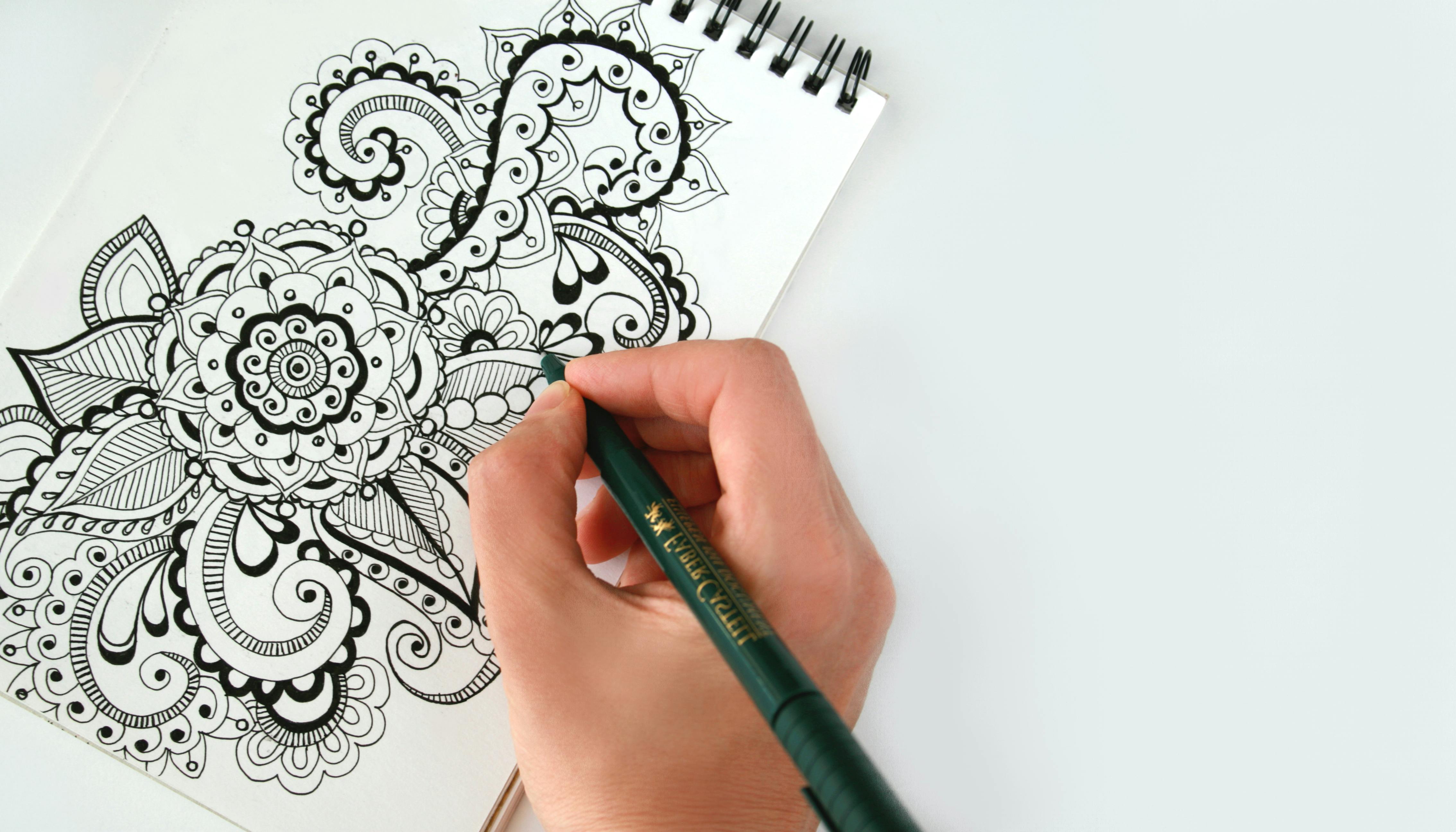
Digital Tools for Drawing Capes
Drawing capes in a digital setting offers some fantastic advantages, letting you experiment with ease and make quick changes. If you're looking for a great place to start, or even if you're a seasoned artist, a free online drawing application like Sketchpad is, well, it's a very solid choice. You can, for instance, create digital artwork to share online and export it to popular image formats like JPEG, PNG, SVG, and PDF. This versatility is, honestly, quite useful.
Sketchpad is available online and for download on PC and Mac, making it accessible for everyone. Whether you're working on a school poster or brainstorming your next comic book character, Sketchpad makes it easy to bring your ideas to life. You can watch videos for tips and tricks on how to use Sketchpad and get the most out of the app, which is, you know, pretty helpful for learning.
When working digitally, you can use layers to separate your cape from your character, making it easier to adjust its shape and flow without messing up the rest of your drawing. Experiment with different brushes for sketching, inking, and shading. A soft airbrush can create smooth shadows, while a textured brush can hint at fabric weave. It’s almost like having an endless supply of art supplies, and, well, it’s incredibly convenient.
Digital tools also allow for easy flipping of your canvas, which helps you spot errors in symmetry or flow. You can also quickly adjust colors and lighting to see what works best. This iterative process is, arguably, a huge advantage for refining your cape drawings. To learn more about digital art tools on our site, you can check out some of our other articles.
Frequently Asked Questions About Drawing Capes
People often have similar questions when they're figuring out how to draw capes. Let's look at some common ones, because, you know, chances are you've wondered about these too.
How do you draw a cape in motion?
To draw a cape in motion, first, think about the direction and strength of the wind or the character's movement. Use curved lines that follow the path of the air or the character's speed. Imagine the cape as a flag blowing in the wind, with its edges trailing behind or whipping around. Add dynamic folds that reflect the push and pull of these forces, making sure some parts billow out while others might cling slightly. It's almost like drawing the invisible forces, and, well, it's a fun challenge to capture.
What makes a cape look realistic?
Making a cape look real involves a few key things. Pay close attention to how fabric behaves in the real world: how it drapes, how it folds, and how light hits it. Vary the types of folds you draw, considering where the fabric is gathered, stretched, or pulled. Apply light and shadow consistently from a single light source, creating highlights on raised areas and deep shadows in crevices. Adding subtle texture, like a hint of weave or a soft sheen, also helps a lot. This is, honestly, a rather important step for believable art.
What are the basic shapes for drawing a cape?
When you're starting to draw a cape, begin with simple shapes like rectangles, triangles, or even a soft, elongated "S" curve. Imagine the cape as a large piece of cloth draped over the shoulders. For a cape hanging down, think of it as a loose cylinder or cone. For one that's flying, picture a wavy flag or a stretched-out ribbon. These basic forms help you establish the overall volume and direction before you add all the detailed folds and wrinkles. It’s a bit like building a simple frame first, and, well, it makes the whole process much easier. You can find more tips on drawing fabric folds right here on our website.
For further inspiration on understanding fabric movement, consider observing real-world examples, perhaps by looking at how clothes move in videos or even by draping a towel over a chair and watching how it settles. This kind of observation is, honestly, a very good way to learn.
200+ Great Drawing Photos · Pexels · Free Stock Photos

Easy Penguin Drawing Ideas, Guides And Tutorials - Glory of the Snow

Online Drawing Collection | Learn How To Draw
