Uncovering Depth: Giving Your Art Real Clarity With Negative Shading
Have you ever looked at a drawing or a painting and felt it just popped right off the page, almost as if it had a life of its own? That feeling of depth, that wonderful sense of something truly three-dimensional, is often a result of clever light and shadow play. It's not just about adding darkness to an object itself; sometimes, the magic happens when you focus on what's around it. This is where negative shading, a really powerful artistic technique, steps in to make a big difference.
For many artists, understanding how light interacts with surfaces can feel like a puzzle, a bit like trying to find your way in a new city. But when you start to explore methods like negative shading, it’s like discovering a new path, one that gives your work a clear sense of direction. It helps you see shapes and forms in a whole new way, allowing you to bring a remarkable sense of presence to your creations.
This article will guide you through the ins and outs of negative shading, showing you how this approach can transform your art. We will look at what it is, why it works so well, and some practical ways you can start using it today. It's about finding that deeper reason behind why some art feels so real, and how you can achieve that in your own pieces, too.
Table of Contents
- What Exactly is Negative Shading?
- The Power of Seeing Differently
- Techniques for Applying Negative Shading
- Common Mistakes and How to Avoid Them
- Negative Shading in Different Art Forms
- Why Negative Shading Matters More Than You Think
- Frequently Asked Questions About Negative Shading
- Finding Your Artistic Purpose with Negative Shading
What Exactly is Negative Shading?
Negative shading, in simple terms, is a method where you give form and definition to an object by shading the space *around* it, rather than directly on the object itself. Think about it, rather, like sculpting with shadows. Instead of adding dark marks to the apple, you add them to the table and the air around the apple. This makes the apple stand out, almost by magic.
It's a bit like how we perceive things in real life, too. Sometimes, we know a shape is there not because we see its own dark side, but because the light behind it or around it tells us it’s present. This technique plays on that very natural way our eyes and brains work together. It's about defining the edges and surfaces through the absence of light in the surrounding area.
The core idea here is to make the background or the empty space do the heavy lifting in showing off your main subject. It's a subtle yet very strong way to create contrast and depth. In a way, it's almost like discovering a hidden purpose in the negative space, giving your art new meaning and a clearer sense of what's truly important in the scene.
When you shade the areas next to an object, you are essentially making its edges pop out. This creates a strong visual boundary. It helps the viewer’s eye understand the object’s shape and where it sits in the picture. This method is often used to show bright objects against a darker setting, making them appear to glow or stand forward.
Many artists find this approach quite liberating. It encourages you to look beyond the obvious. Instead of just focusing on the object itself, you start to consider its environment. This holistic view, so to speak, can truly enrich your artistic practice and lead to more compelling compositions. It's a great way to think about how everything in your picture works together.
The light source plays a really big part in all of this, too. You need to know where the light is coming from to correctly shade the negative areas. If the light is hitting the front of your subject, then the areas behind and around it would typically be darker. This creates a natural sense of light and shadow, guiding the viewer's gaze right where you want it to go.
The Power of Seeing Differently
The real strength of negative shading comes from how it influences our perception. When you shade the space around an object, your brain fills in the gaps, creating the illusion of a solid form. This makes the object seem to have weight and presence, even if you haven't put a single mark on its surface. It's a very clever trick for the eyes.
This method helps to create a strong sense of depth. It can make an object appear closer or further away, depending on how you use the shadows. A darker background can make a light object seem to jump forward, almost as if it's coming out of the page. This creates a very dynamic and engaging visual experience for anyone looking at your work.
Using negative shading also brings out the form of an object without needing to add a lot of detail to the object itself. This is especially useful for showing smooth, shiny, or very light surfaces. You can keep the object clean and bright, letting the surrounding darkness do the work of defining its shape. It’s a subtle way to achieve a powerful effect.
It’s a bit like reflecting on past experiences to give your life direction. Just as those reflections help you understand where you are and where you are going, negative shading helps the viewer understand the object’s position and form in the artwork. It gives a clear sense of how things are arranged in the space you’ve created.
Moreover, this technique is excellent for creating a focal point. When one area is sharply defined by its shaded surroundings, it naturally draws the eye. This means you can guide your viewer's attention to the most important part of your artwork without needing to add bright colors or flashy elements. It’s a quiet but very effective way to lead the eye.
The contrast created by negative shading can also add a dramatic flair to your pieces. A stark difference between a light object and a dark background can evoke strong feelings or highlight a particular mood. It’s a very versatile tool that can be used for many different artistic expressions, from quiet studies to bold statements.
Many artists find that practicing negative shading helps them to see the world in a more nuanced way. You start to notice the shapes of the spaces between objects, rather than just the objects themselves. This shift in perspective can truly broaden your artistic vision and make you a more observant creator, which is a very good thing.
Techniques for Applying Negative Shading
Applying negative shading can be done in many ways, depending on your chosen art form and tools. The key is always to focus on the area around your subject, making it darker to push the subject forward or define its shape. It’s about building up the darkness in the 'empty' spots, so to speak.
Drawing and Sketching
In drawing, a common way to use negative shading is through methods like cross-hatching or stippling. You apply these marks not to the object itself, but to the paper around it. For instance, if you are drawing a white vase, you would shade the wall behind it or the table it sits on, making the vase appear brighter and more solid. You are, in effect, drawing the air around the vase.
Another approach is to use a soft, even tone for the background. You might use the side of your pencil to lay down a smooth layer of graphite. Then, you carefully work around the edges of your subject, making sure the background tone is darker right up to the object's outline. This creates a very clean and defined edge for your subject, making it stand out quite well.
You can also use a kneaded eraser to lift graphite from around your subject, making the negative space lighter. This creates a similar effect but in reverse. It's about controlling the values in the background to emphasize the foreground. So, you are essentially shaping the light by removing the dark, which is pretty neat.
For more textured effects, you could use scumbling or circular motions in the negative space. This can add a sense of atmosphere or movement around your subject. The goal is always to create a contrast that makes your main object pop. It’s all about making the surrounding darkness work for you.
Painting and Digital Art
In painting, negative shading involves building up layers of darker paint around your subject. This could mean using glazes, which are thin, transparent layers of color, to gradually darken the background. As you add more layers, the background becomes deeper and richer, making your subject seem to emerge from the canvas.
For digital art, the process is quite similar but often more forgiving. You can use different brushes and blend modes to apply shadows to layers behind your main subject. Tools like masks are incredibly useful here. You can paint freely on a layer and then use a mask to reveal or hide parts of it, shaping the negative space with great precision.
Many digital artists use soft airbrushes or gradient tools to create smooth transitions in the background. This can help to give your subject a soft, ethereal glow. Or, you might use harder brushes for a more dramatic, defined edge. The flexibility of digital tools makes experimenting with negative shading very easy, which is a big plus.
You can also play with color temperature in your negative shading. Using cooler, darker colors for the background can make warmer, lighter objects seem to advance. This adds another layer of depth and visual interest to your work, giving it more visual appeal. It’s a very effective way to make things feel real.
Photography and Other Media
In photography, negative shading is about controlling light and shadow in your scene. You might use a dark backdrop or position your subject against a shadowed area. The lighting itself can be arranged so that the subject is brightly lit while its surroundings fall into darkness. This naturally emphasizes the subject and gives it a powerful presence.
For example, in portrait photography, you might use a single light source to illuminate the subject's face, letting the background fall into deep shadow. This isolates the person and makes their features stand out dramatically. It's a very common technique for creating striking and emotional images, you know.
Even in sculpture, the concept of negative space is incredibly important. The empty areas around and within a sculpture contribute to its overall form and impact. A sculptor might carve away material to define a shape, making the 'negative' space part of the artwork itself. This is a very interesting way to think about space.
For any medium, the key is to observe how light behaves. Pay attention to how shadows fall and how they define shapes in the real world. Then, try to replicate that effect in your art by focusing on the areas that are *not* your main subject. This practice can truly sharpen your eye and improve your artistic vision, so it's worth the effort.
Common Mistakes and How to Avoid Them
While negative shading is a powerful tool, it's easy to make a few common missteps. One very common error is overdoing it, making the background too dark or too busy. This can make your subject look muddy or get lost in the overwhelming darkness. The goal is to enhance, not to obscure, your main focus.
To avoid this, try to build up your shadows gradually. Add light layers of shading and then step back to look at your work. You can always add more, but it's much harder to take away. Think about the overall balance of light and dark in your piece. It's about finding that sweet spot where the contrast is just right.
Another mistake is not having enough contrast between your subject and the negative space. If the background is only slightly darker, your subject won't pop out as much as you might want it to. The trick is to ensure there's a clear difference in value. This doesn't mean the background has to be black, but it needs to be noticeably darker than the parts of your subject you want to highlight.
Sometimes, artists forget about the light source when applying negative shading. The shadows in the negative space must be consistent with where the light is coming from. If your light is from the left, the shadows should logically fall to the right. Inconsistent shadows can make your artwork look flat or unnatural, which is not what we want.
A further point to watch out for is making the negative space too uniform. A flat, uninteresting background can sometimes detract from your subject, even if the values are correct. Try to add some subtle variations in texture or tone to the negative space, just enough to keep it interesting without drawing attention away from your main subject. This can give your art a more polished look.
Lastly, some people assume negative shading only works for very bright objects. While it's great for that, it can also be used with darker subjects. For instance, a dark object against a slightly less dark, but still shadowed, background can still create depth. It’s all about the relative values, not just absolute lightness or darkness, you know.
Practicing regularly and observing how light and shadow behave in the real world will greatly help you avoid these pitfalls. Don't be afraid to experiment and learn from your attempts. Every mark you make, even a "mistake," teaches you something valuable about how to improve your craft, really.
Negative Shading in Different Art Forms
Negative shading is not just for pencil drawings; its principles apply across a wide range of artistic disciplines. Understanding how it translates can open up new creative avenues for you, which is pretty exciting. It’s a very versatile concept, you see.
In **fine art**, like traditional oil or acrylic painting, artists often use negative shading to create dramatic chiaroscuro effects. Think of old master paintings where figures seem to emerge from deep, dark backgrounds. This is often achieved by building up layers of dark paint around the lighter forms, making them glow. It gives the artwork a timeless quality, too.
**Graphic design** uses negative space and, by extension, negative shading, quite often. Logos, for instance, sometimes rely on the shape of the empty space to reveal a hidden image or meaning. The FedEx logo, with its arrow in the negative space between the 'E' and 'x', is a classic example. This shows how important what *isn't* there can be.
**Photography**, as we touched on, is a natural fit for negative shading. High-key and low-key photography styles heavily rely on using light or darkness in the background to emphasize the subject. A bright subject against a dark background is a very common way to make it stand out. This is a very powerful way to make an image impactful.
Even in **sculpture**, the concept of negative space is absolutely vital. The voids and empty areas around and within a sculpted form contribute to its overall shape and balance. A sculptor might intentionally create a hole or an opening to define the surrounding mass. This shows that negative shading is not just about two dimensions; it has a real impact on three-dimensional art, too.
In **illustration and comic art**, negative shading helps define character outlines and background elements quickly and effectively. It can create a sense of speed or mystery. A character silhouetted against a lighter, perhaps glowing, background immediately conveys a sense of importance or dramatic tension. It’s a very quick way to get a mood across.
For **architecture**, the way light and shadow fall on buildings can create stunning negative shading effects. The shadows cast by one part of a building on another, or on the ground, define its form and scale. Architects think about these light and shadow plays from the very start of their design process. It’s all about how the structure interacts with its surroundings.
So, you see, the idea of defining something by its absence or by its surroundings is a fundamental principle that spans across many creative fields. It’s a testament to how our brains perceive the world. Understanding this universal concept can truly enrich your creative work, no matter what medium you choose to explore, really.
Why Negative Shading Matters More Than You Think
Negative shading is more than just a technique; it's a way of seeing. It encourages artists to look beyond the obvious, to consider the relationships between objects and the space they inhabit. This kind of observation is what truly elevates art from a mere depiction to something that feels alive and meaningful. It’s about finding that deeper reason behind your artistic choices.
It adds a level of sophistication to your work that can be hard to achieve with other methods. When done well, negative shading makes your art look professional and thought-out. It shows that you understand how light works and how to manipulate it to your advantage. This gives your pieces a very polished and complete appearance.
This method also helps artists to "discover their true purpose" in a piece, in a way. By focusing on the negative space, you often find new compositional possibilities or realize how much impact the background can have. It’s a journey that combines introspection with action, leading to a more holistic view of your place in the artistic world.
Using negative shading effectively can also give your art a strong sense of emotional stability. The clear definition of forms and the deliberate use of contrast can make a piece feel grounded and well-composed. This can evoke a feeling of calm or strength in the viewer, which is a very desirable outcome for many artists.
It’s a way to truly live with clarity and intention in your artistic practice. When you consciously decide how the negative space will define your subject, you are making a deliberate choice that impacts the entire composition. This kind of intentionality leads to stronger, more impactful artwork, honestly.
Furthermore, mastering negative shading can lead to increased energy and motivation in your creative process. Seeing the dramatic improvements in your work as you apply this technique can be incredibly encouraging. It pushes you to explore more, to experiment further, and to keep refining your skills. It’s a very rewarding part of the artistic journey.
The timeless appeal of this technique means it remains relevant, no matter the current trends. While tools and styles may change, the fundamental principles of light, shadow, and perception stay the same. So, learning negative shading is an investment in a skill that will serve you well throughout your entire artistic life, which is a great thing.
Frequently Asked Questions About Negative Shading
What is the opposite of shading?
The opposite of shading is often considered to be highlighting or rendering the light areas. While shading adds darkness to show form and shadow, highlighting adds brightness to show where light hits. In a broader sense, you could say the opposite of shading (adding dark) is making something lighter, perhaps by erasing or using white. It’s about creating contrast.
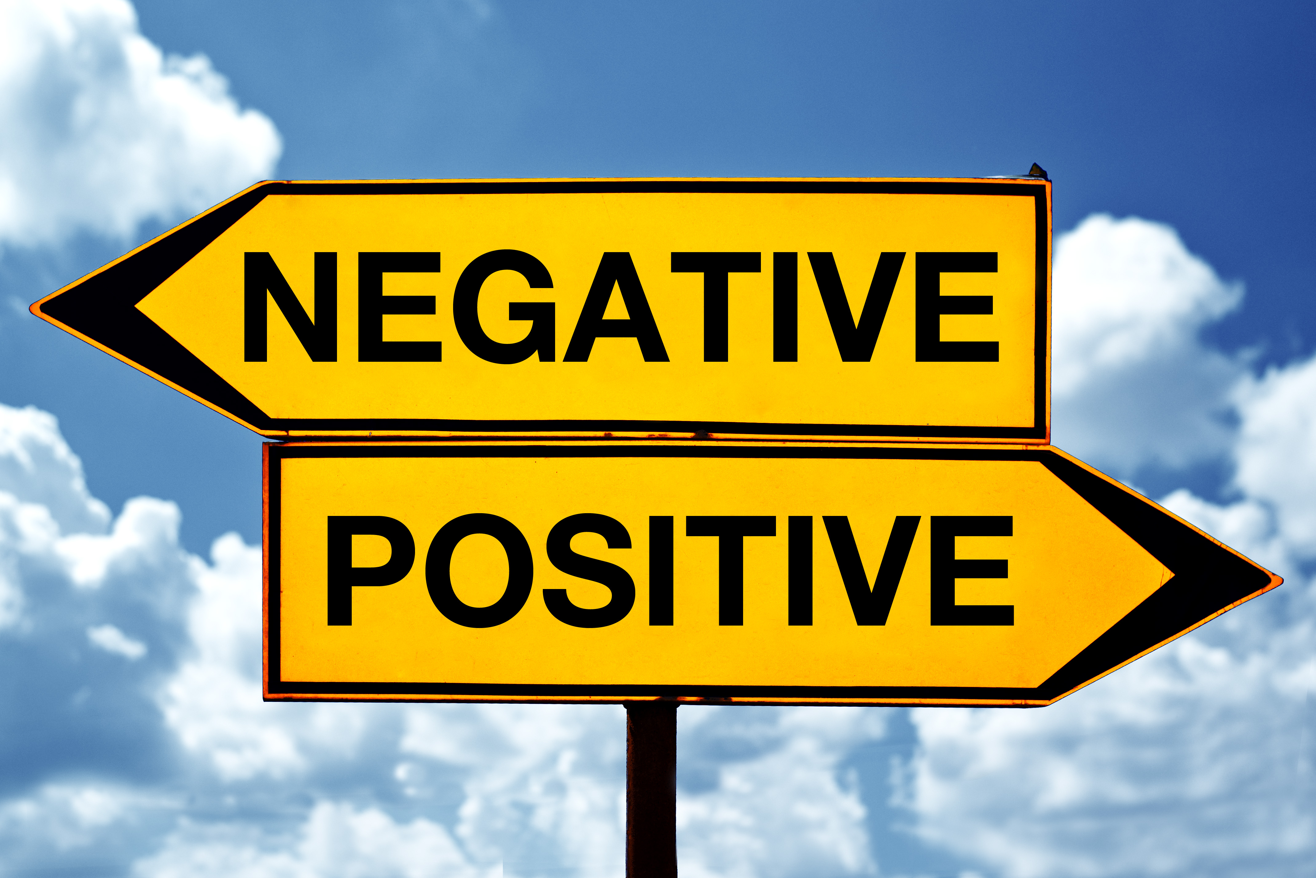
What is positive and negative shading?
Positive shading refers to adding darkness directly to the object itself to show its form and shadows. For example, shading the underside of an apple to make it round. Negative shading, on the other hand, is adding darkness to the space *around* the object to define its shape and make it stand out. It’s about making the background work to define the foreground. Both are important for creating depth.
How do you create negative space in art?
You create negative space by focusing on the areas that are not your main subject. This can involve drawing or painting the background, the empty space between objects, or the areas around a figure. By defining these "empty" areas, you automatically define the positive shapes (your subjects). It's a way to use the absence of something to give presence to something else, which is quite clever.
Finding Your Artistic Purpose with Negative Shading
Negative shading is a truly powerful tool in an artist's kit, offering a unique way to bring depth, form, and impact to your creations. It challenges you to see beyond the obvious, to recognize the importance of the spaces surrounding your subjects. By mastering this technique, you gain a deeper understanding of light, shadow, and how they interact to shape our visual world.
Like finding your life's direction, mastering negative shading is a journey that combines introspection with action. It asks you to reflect on how you perceive forms and then to act on that perception with your chosen medium. This process can be incredibly rewarding, leading to artworks that possess a clear sense of purpose and a compelling visual story.
So, why not give it a try? Pick up your pencil, brush, or camera, and start experimenting with defining your subjects by what surrounds them. Explore how the background can push your foreground forward, or how the empty space can carve out a form. You might just discover a whole new dimension in your art, and that's a pretty exciting prospect, honestly.
Learn more about art on our site, and discover other shading methods on this page. For more general art technique resources, you might find useful information at arttechniquesonline.org.
Negatives and Double Negatives: Definitions and Examples | Grammarly

Negative And Negative Equal Positive Chart
Positive Negative Sign
